Steak Shack
Mobile app to browse, customize, and order steaks.


Project Overview
Steak Shack is a mobile ordering app built around one thing — the steak. The design challenge was creating an experience that made browsing, customizing, and ordering feel as indulgent as the meal itself. Every interaction needed to reflect the quality and personality of the brand, turning a functional ordering flow into something that actually built appetite and anticipation.
The Problem
Most food ordering apps prioritize speed and utility over experience. That works for fast food, but it falls flat for a product where quality, customization, and the ritual of a good meal are core to the appeal. Steak Shack needed an app that respected the product — one where the design made you hungry before you even placed an order.
Key challenges going into the project:
Designing a customization flow that felt intuitive rather than overwhelming
Using visual design to convey quality and appetite appeal without relying solely on photography
Balancing a rich, indulgent aesthetic with a clean, fast ordering experience
Research & Discovery
I mapped the ordering flows of leading food apps — Shake Shack, Chipotle, and Domino's — to identify where customization flows break down and where visual design either builds or kills appetite. Claude was used throughout the research phase to help synthesize findings and define the design principles that would guide the project: richness without clutter, indulgence without friction.
Two user needs shaped the design direction:
The Customizer — wants full control over cut, doneness, sides, and sauces without feeling lost in options
The Quick Order — knows what they want, needs to get there in as few taps as possible
Design Decisions
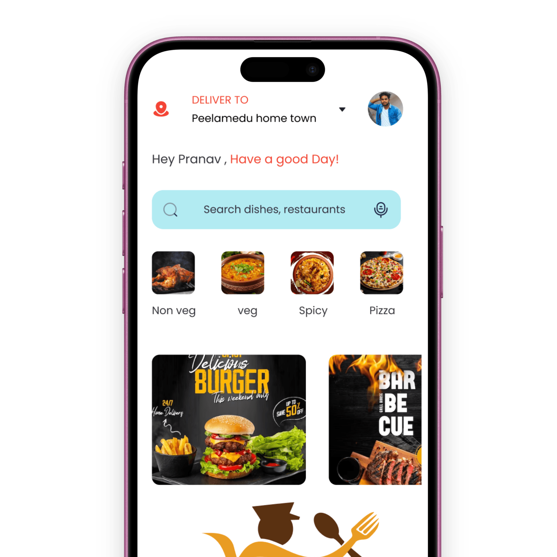
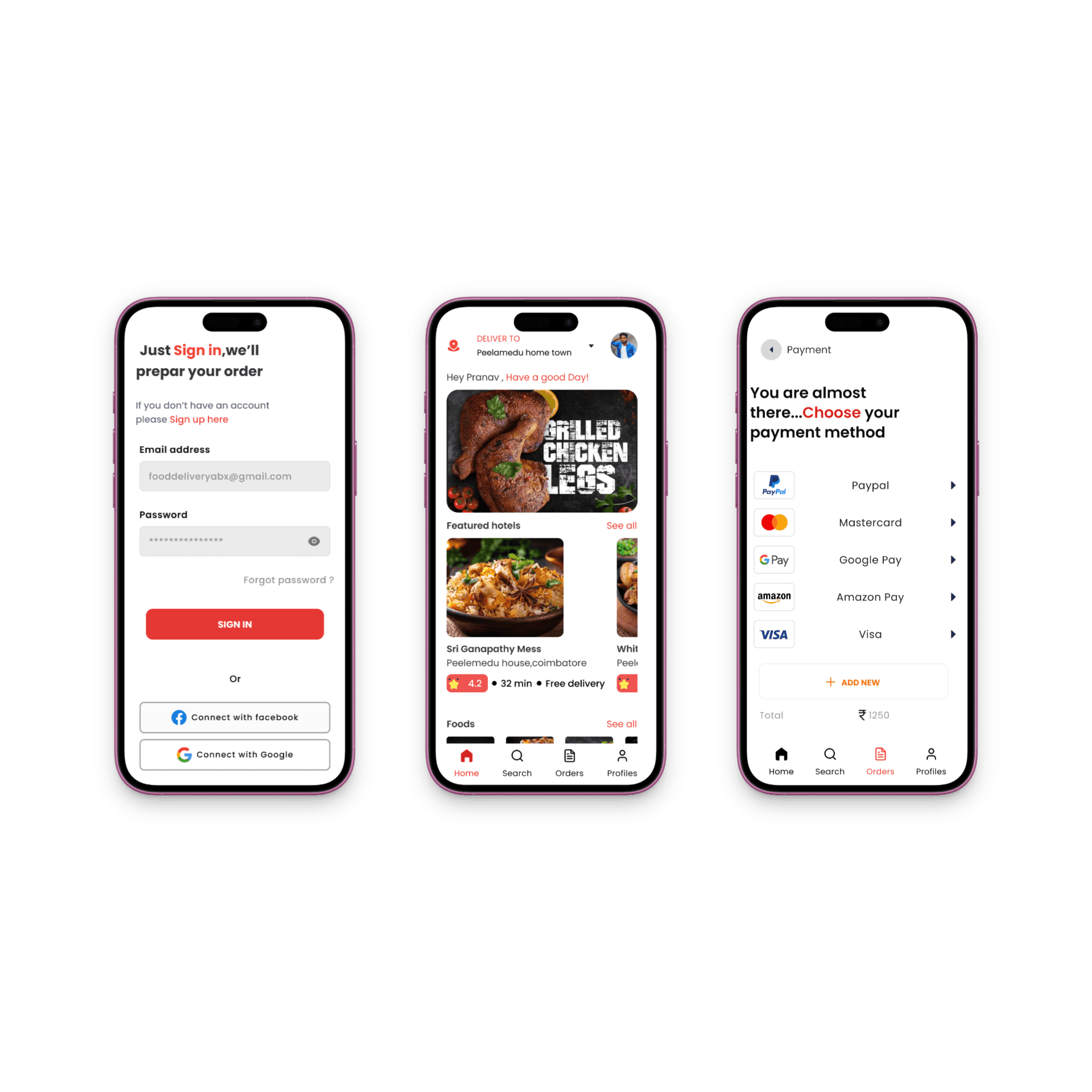
Appetite-first visual design — Product photography was treated as the hero of every screen, with Photoshop used extensively to retouch and composite food imagery that felt premium and craveable. Dark, warm tones throughout the UI reinforced the steakhouse atmosphere without resorting to clichéd red-and-black branding.
Guided customization flow — The customization screen was structured as a step-by-step builder rather than a single overwhelming form. Each choice — cut, doneness, sides, sauce — was presented one at a time with clear visual feedback, making the process feel considered and enjoyable rather than tedious.
Persistent order summary — A minimal order bar stays visible throughout the customization flow, giving users a constant sense of progress and reducing the anxiety of losing track of what they've built.
Clean system foundations — All wireframing, component design, and screen architecture were built in Sketch, establishing a solid structural foundation before the rich visual layer was applied. Claude helped refine the UX copy — menu descriptions, confirmation states, and empty states — keeping the tone confident and on-brand throughout.
Key Challenges
The toughest design problem was the customization flow for users who want speed. A step-by-step builder is great for first-time users but can feel slow for returning customers who already know their order. The solution was a saved orders feature surfaced prominently on the home screen, allowing repeat customers to reorder in one tap while keeping the full builder available for new or exploratory orders.
Outcomes & Reflections
The final design delivers an ordering experience that feels worthy of the product — rich, considered, and genuinely enjoyable to use. The visual system builds appetite from the first screen, and the customization flow makes the process of building your meal part of the pleasure.
Next steps would prioritize user testing the customization flow with both first-time and returning users to validate the step-by-step approach, and exploring a loyalty and rewards layer that reinforces repeat ordering behavior.